
Etsy Thumbnail Tips: How to Choose a First Photo That Gets Clicks
Your Etsy thumbnail is the smallest, most important photo in your shop.
It's the image buyers see before they see your title, your price, or anything else about your listing. In a search results grid packed with competing products, your thumbnail has roughly two seconds to earn a click. Everything else — your description, your reviews, your pricing — only matters if your thumbnail does its job first.
Here's how to choose, crop, and test your main listing photo so it stands out in search and pulls more buyers in.
Why Your Thumbnail Matters More Than Any Other Photo
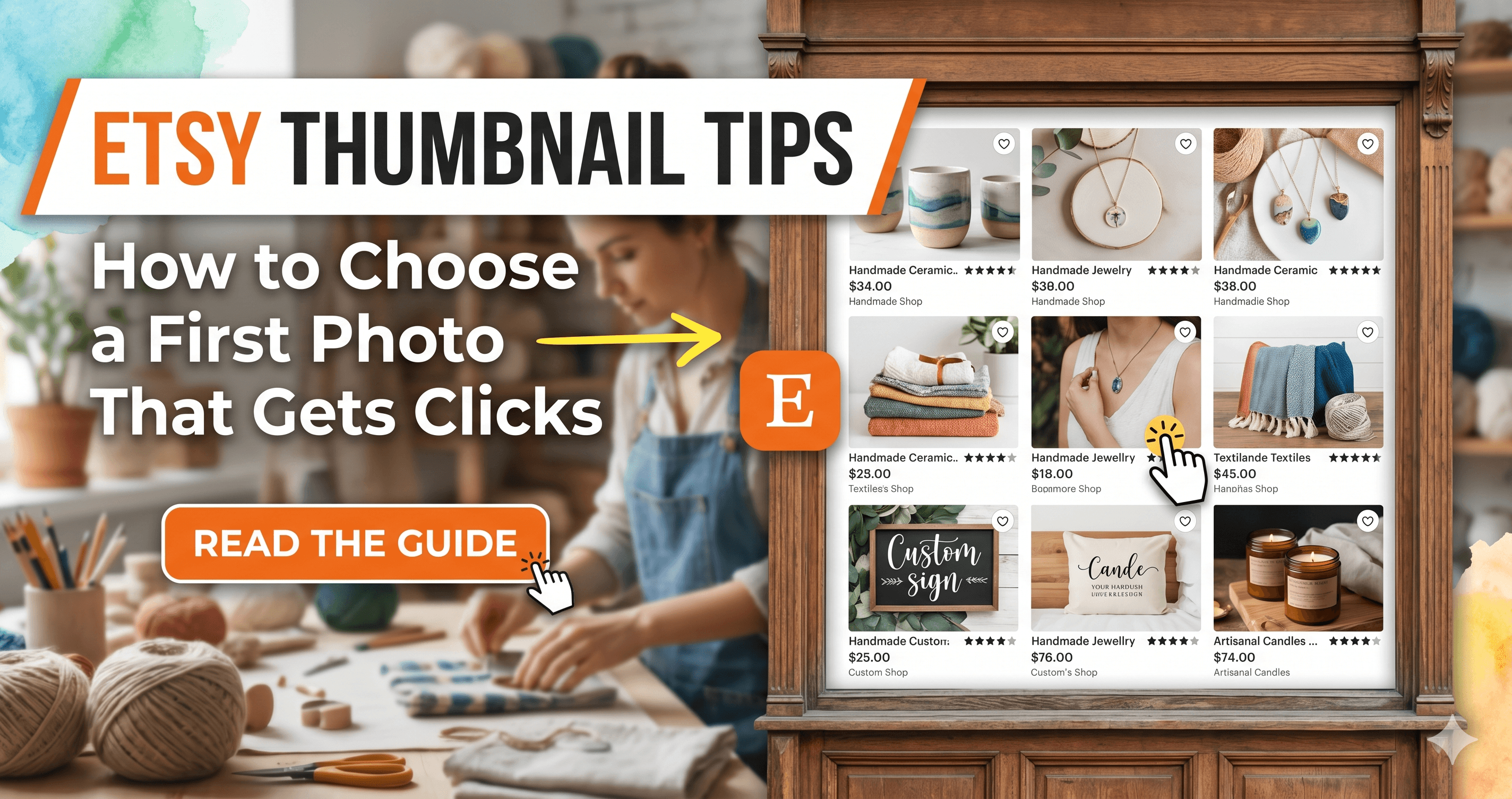
When shoppers search Etsy, they see a grid of thumbnails. On desktop, that grid shows roughly 48 listings per page. On mobile, it's fewer — but the stakes are higher, because over 60% of Etsy traffic comes from mobile devices where thumbnails appear even smaller.
Your thumbnail competes against dozens of alternatives at once. Buyers scan the grid looking for something that catches their eye, and they click the one that does. If your thumbnail blends in, you lose the click before the buyer has read a word of your listing.
Here's what makes this especially high-leverage: click-through rate is a ranking signal. When buyers consistently click your listing over others in the same search, Etsy interprets that as a relevance signal and shows your listing more often. A stronger thumbnail doesn't just get you more clicks today — it improves your organic placement over time.
If your listings are appearing in search but not getting clicks, the problem is almost always your thumbnail. Photo improvements show results within days of updating, not weeks.
What Etsy Actually Does With Your First Photo
Etsy uses your first listing photo as the thumbnail everywhere buyers encounter your listing: search results, category pages, Etsy ads, email recommendations, and your shop homepage grid.
That means your first photo needs to work in multiple contexts, at multiple sizes, and on both desktop and mobile screens. A photo that looks great at full size can lose all its detail when compressed to thumbnail dimensions.
Etsy crops thumbnails to a square (1:1) ratio by default. If your photo is landscape or portrait orientation, Etsy center-crops it automatically. This matters because a product positioned near the edge of a landscape photo can get cropped out of the thumbnail entirely.
The safest approach: shoot or crop your main listing image as a square, with the product centered and filling 70–80% of the frame.
5 Thumbnail Decisions That Affect Click-Through Rate
1. Background Choice
Your background is the first thing that separates your thumbnail from the competition. White backgrounds are clean and professional, but when every listing in a category uses them, the search results grid becomes visually identical. Your listing disappears.
Test this now: search your primary keyword on Etsy and look at the first page of results. Count how many listings use a plain white background. If most of them do, a light textured surface, a muted lifestyle setting, or a soft contrasting color can give your thumbnail enough visual separation to earn the click.
White backgrounds are not inherently wrong — they just need to be chosen with the search results grid in mind, not in isolation.
2. Product Fill and Framing
Your product should dominate the frame. Buyers scan thumbnails at small sizes, and a product that's too small or surrounded by excess dead space is harder to read quickly and less compelling as a click target.
A reliable rule: your product should fill 70–80% of the frame. Leave enough border that it doesn't get awkwardly cropped, but don't let background space compete with the product for attention.
For products with multiple components — a gift set, a collection of items, a product with accessories — decide whether your thumbnail shows the full set or focuses on the hero item. The full set communicates value. The hero item reads more clearly at small sizes. Both are worth testing.
3. Lighting and Color Accuracy
Dim, dark, or yellow-toned thumbnails signal lower quality before buyers read a single word. Bright, accurate lighting makes your product look worth clicking even at thumbnail scale.
If your product photos have a warm yellow cast from indoor overhead lighting, that cast is amplified when images are compressed to thumbnail size. It also makes products look different from what buyers receive, which affects post-purchase satisfaction.
Daylight or a daylight-balanced LED panel fixes this. The goal is bright, even light that shows your product's true color without harsh shadows. The same lighting principles that improve your thumbnail carry through to every photo in your listing.
4. Lifestyle vs. Studio as Your Main Image
Whether to lead with a studio shot or a lifestyle photo depends on your category and competition — there's no universal right answer.
In some categories (jewelry, enamel pins, stickers), a clean studio shot reads more clearly at thumbnail size because detail matters more than context. In others (home decor, candles, textiles, greeting cards), a styled lifestyle image stands out because it creates mood and triggers an emotional response that a plain background simply doesn't.
Search your category and identify the listings with the highest number of reviews — a reliable proxy for sales volume. Study what those sellers use as their thumbnail. Patterns emerge. Use those patterns to inform your choice rather than guessing.
5. Text Overlays
Some sellers add short text to their main image — "Gift Wrapped," "Personalized," "Free Shipping." Used carefully, text overlays communicate key selling points that don't appear in the thumbnail title at small sizes.
Used poorly, they clutter the image and compete with the product for visual attention. If you use text, keep it to 3–5 words, place it away from the product itself, and check how it reads at 30% browser zoom before publishing.
How to Test Your Thumbnail Before Publishing
You don't have to guess whether your thumbnail will work. You can test it before you commit.
The 30% zoom test: Open your listing on Etsy and zoom your browser down to 30%. Look at your thumbnail alongside the listings around it in the search grid. Does it stand out? Is the product still readable? Does it look as competitive as the listings next to it?
The mobile test: Open your listing on your phone and look at how your thumbnail renders in the search results grid. Mobile displays compress thumbnails further. If something is hard to read on mobile, it's reducing your click-through rate on more than half your traffic.
The competitor comparison: Search your primary keyword, screenshot the first page of results, and compare your current thumbnail to the top sellers. Where does yours fall short? Where does it stand out? This gives you a concrete target rather than a vague improvement goal.
Run these tests on your highest-traffic listings first. Those are where thumbnail improvements produce the fastest, most measurable results.
Where ClickReadyAI Fits Into Your Thumbnail Strategy
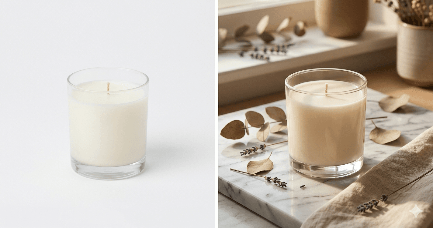
One of the most effective thumbnail upgrades is switching from a plain-background studio shot to a lifestyle image — but producing lifestyle shots takes time, props, and setup that most sellers can't spare for every product.
ClickReadyAI removes that bottleneck. Upload one product photo and get back 6 photorealistic lifestyle scenes at listing-ready quality. You can test which scene performs best as your thumbnail, use the others in slots 2 through 10, and do the whole thing without a single photoshoot.
For sellers who need to upgrade thumbnails across multiple listings, this changes the math entirely. Every product gets a lifestyle option. Every thumbnail decision becomes a real test rather than a compromise between what you want and what you have time to produce.
Thumbnail Checklist: Run This Before Every Listing
Before you publish or update a listing, check your main image against this list:
Product fills 70–80% of the frame
Photo is cropped square or the product is centered to survive Etsy's automatic crop
Lighting is bright and color-accurate with no yellow cast
Background provides visual contrast from most competitors in your category
Thumbnail reads clearly at small size on a phone screen
If lifestyle, the setting fits your shop's overall aesthetic
If text overlay is used, it's 3–5 words and does not cover the product
Your thumbnail is the first impression that determines whether buyers engage with everything else you've built in your listing. Improving it doesn't require a new camera or a photographer. It requires knowing what's competing against you in search and making deliberate choices that give your product a real shot at the click.
Start with your five best-selling products. Apply the checklist. Test the changes. Then work through the rest of your shop with what you learn.
Related: Etsy Conversion Rate: Why People Click Your Listings But Don't Buy